


Enter to SARTU:
To be, rather than to have
ㅤ
SARTU, led by Creative Director So-Young Jang and Co-Director Jae-In Kim, emerges at the intersection of artistry and purpose.

Inspired by the work 'Cheonjimun' (천진문) by artist Hyeong-Geun Yoon which symbolises a door connecting heaven and earth,
SARTU derives its name from the Spanish word meaning 'to enter'.
This encapsulates its mission to enrich personal experiences and foster self-expression through its products.
ㅤ
Sartu evolves around the concepts:
ENTER
ESSENCE
CONNECTION
These three keywords are connected like the vertices of a triangle, creating a virtuous cycle.
Sartu aims for their clients to experience more than simple consumption and feel the essence of the brand.
ㅤ
-
ㅤ
The brand's slogan, "Enter to SARTU: To be, rather than to have," echoes philosopher Erich Fromm's ideals, emphasising inner harmony and personal fulfilment over materialistic possessions. This philosophy permeates all aspects of SARTU's strategy and product offerings.
ㅤ
SARTU places utmost importance on quality and longevity. By prioritising unique pattern combinations and utilising premium materials, the brand ensures its products are not only aesthetically distinctive but also durable—a commitment aligned with environmental, social, and governance (ESG) principles.
ㅤ
-
ㅤ
Sartu differentiates itself from other brands with a distinct brand concept: brutalism.
Brutalism is an architectural technique adapted for rapid urban reconstruction after World War II. Exposed concrete was used at the time because it was simple and inexpensive; and has been accepted in modern times for its unique aesthetic beauty of its original texture. This concept has heavily influenced the direction of SARTU's brand spirit.
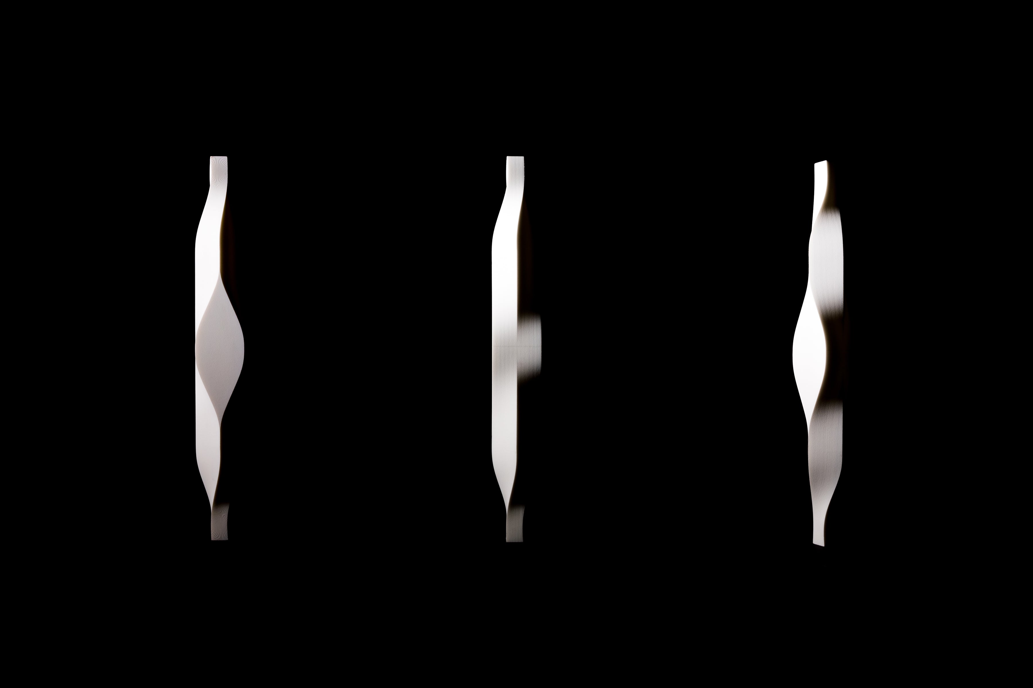
Drawing from brutalist architecture, SARTU's photography highlights the interplay of light and shadow, mirroring the aesthetic beauty and pragmatism that define its brand image. This visual approach, influenced by works like Se-yoon Park's <Light and Darkness>, underscores the brand's dedication to elegant and innovative design.
ㅤ
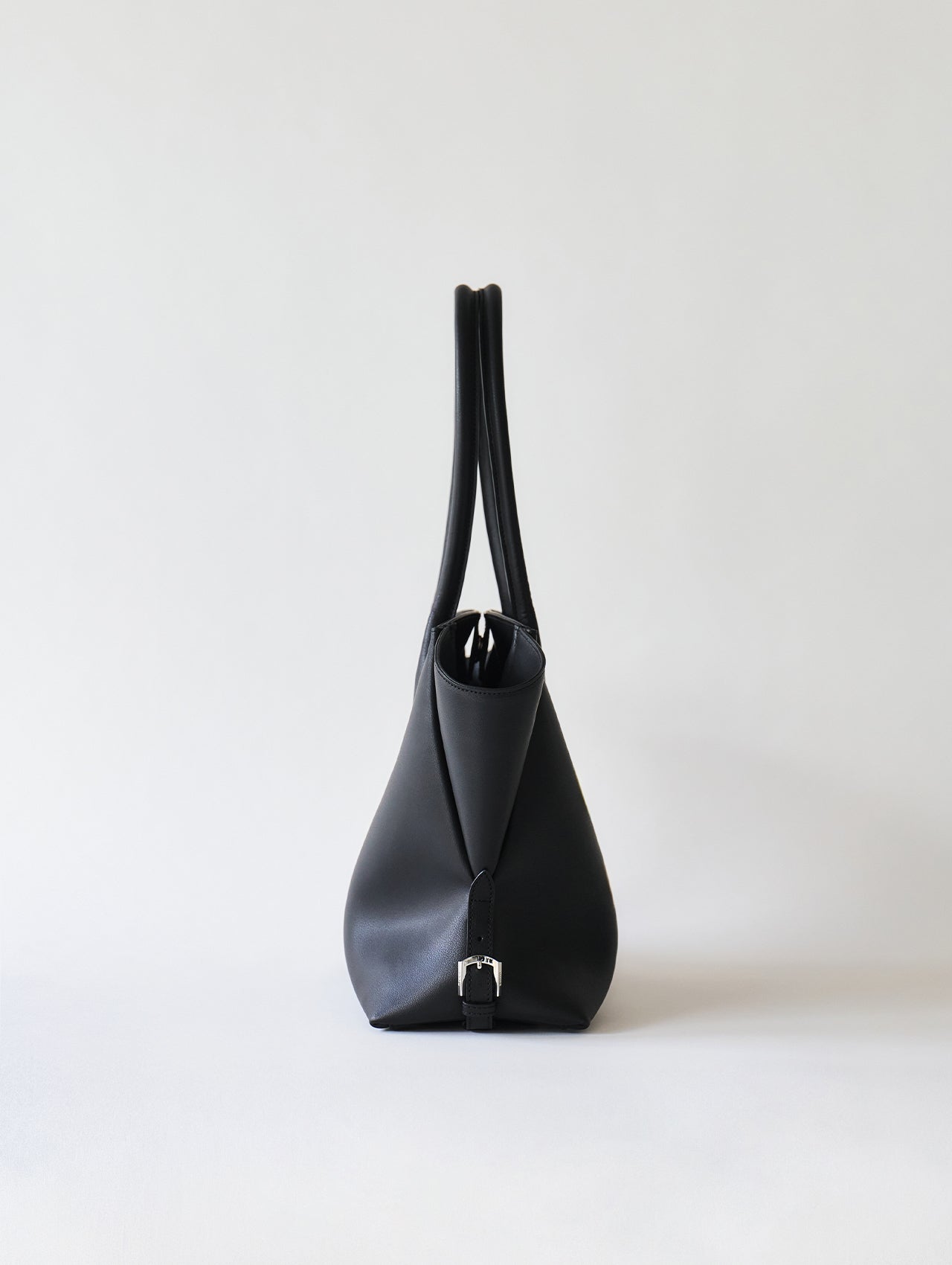
SARTU product names are inspired by patterns.
For example, their signature product, the TYE shoulder bag has a T-shaped pattern with Y-shaped wings, creating an organic harmony between the voluminous surface and soft curves.
The name TYE also has the ambiguous meaning of "tie", meaning to tie patterns together.